The Color and Design Principles Behind Every T-Shirt Quilt Layout
May 19, 2026 · By Wesley Hall
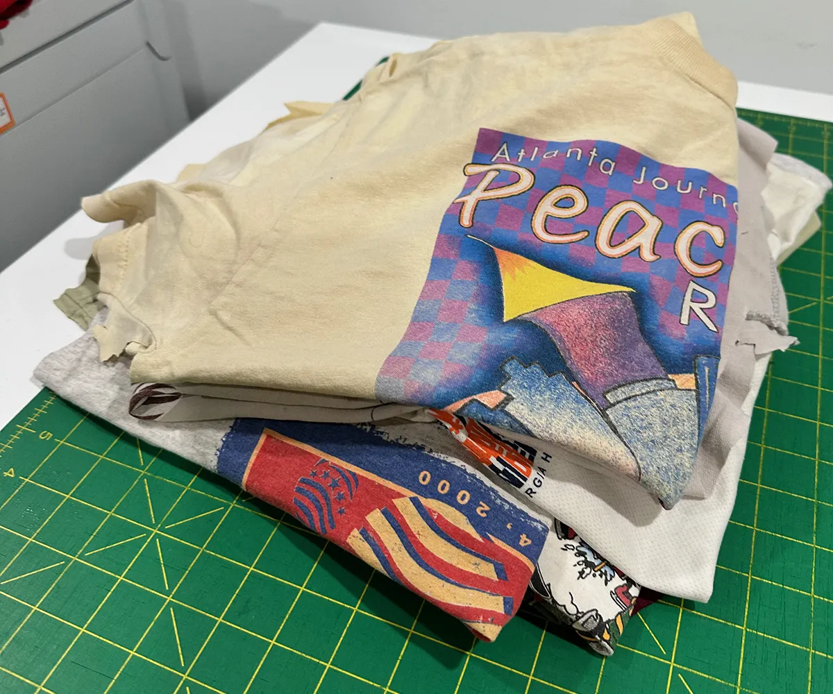
When a stack of shirts arrives at my studio, the sewing is honestly the easy part. The real work, the part that determines whether a finished quilt feels cohesive and intentional or just like a grid of random squares, is the layout. Every quilt I make goes through a deliberate design process before a single seam gets sewn, and I want to walk you through exactly what that looks like.
Step One: Standardizing the Blocks
The first thing I do with any pile of shirts is find the graphic sizes. T-shirt graphics vary wildly, a band tee might have a huge chest print, while a 5K race shirt might have a small logo over the pocket. I look at each graphic and determine the largest block size that lets me capture every design fully without cropping anything important.
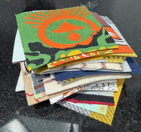
Once I have that anchor size, I cut all the blocks to match. This is what gives the finished quilt its clean, structured look. Every block the same size means the grid lines up perfectly and nothing feels out of proportion.
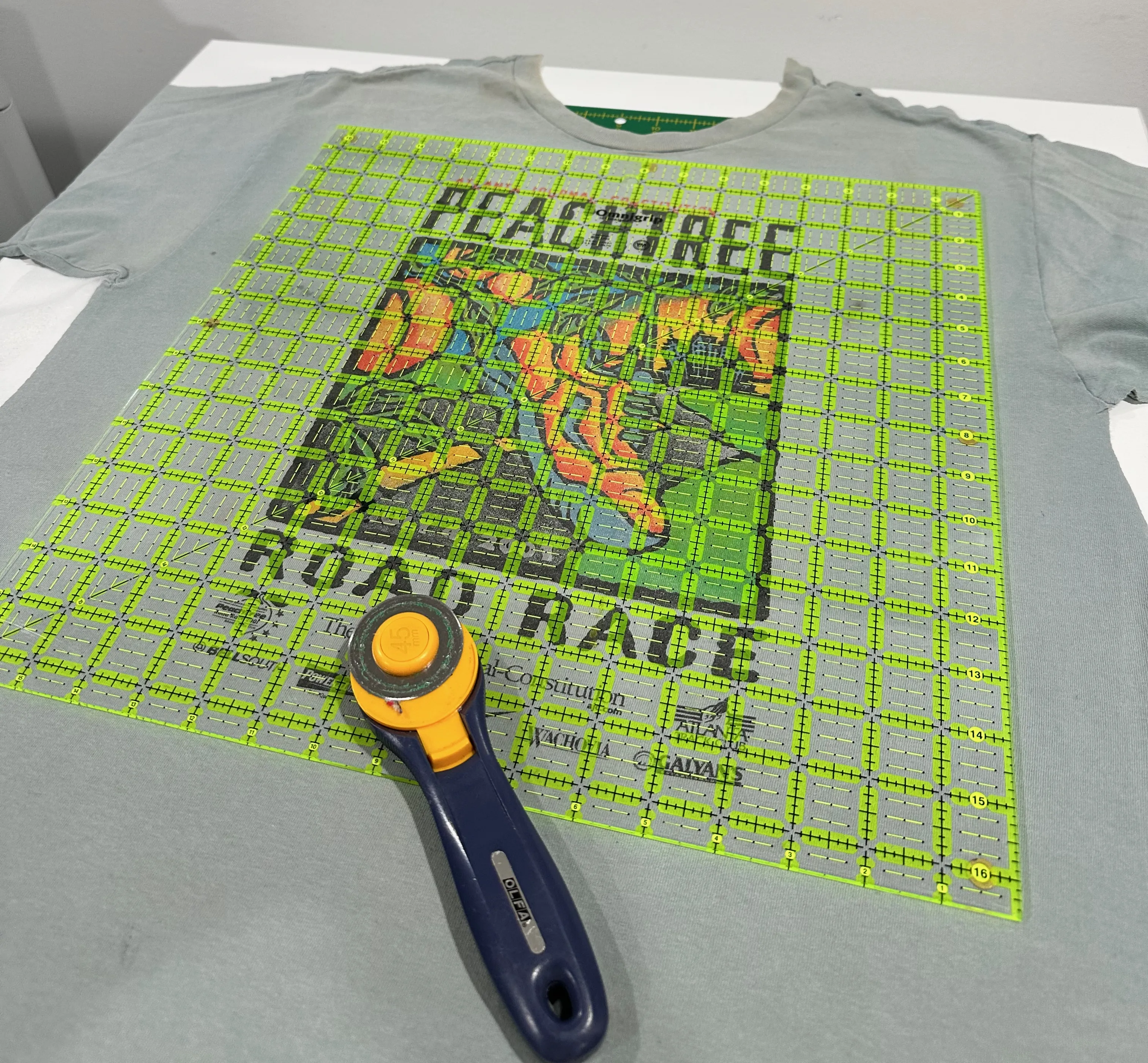
After cutting, I photograph every individual block. This is where the real layout work begins. Having photos of each block lets me arrange and rearrange them digitally, and this is where I often bring in AI to help me think through the combinations before I commit to anything.
Color Distribution: No Clumping
The most common layout problem I see, and the thing I work hardest to avoid, is color clumping. If all the red shirts end up in the bottom right corner and all the blue shirts drift to the top left, the quilt looks unbalanced even if you can't immediately put your finger on why.
My goal is to spread each color family evenly across the entire grid. Think of it like planting a garden, you wouldn't put all your red flowers in one bed and all your yellow ones in another. You want color echoing across the whole surface, so your eye naturally travels around the quilt rather than getting stuck in one spot.
With larger quilts, this can get complex fast. When I'm working through a 40 or 50 shirt quilt, I'll often use Claude AI to help me think through the distribution systematically, describing the color of each block and asking for arrangement suggestions that keep similar colors separated. It's a genuinely useful tool for that kind of combinatorial problem.
Visual Weight and Busy vs. Simple Blocks
Color is only part of the equation. Visual weight matters just as much. A shirt with a large, bold graphic, lots of detail, high contrast, maybe a dark background, carries more visual weight than a simple text-only shirt on a light background. If you cluster all the heavy blocks together, that area of the quilt will feel dense and overwhelming, while the rest feels empty.
I deliberately alternate heavy and light blocks throughout the layout. A bold graphic gets a quieter neighbor. A busy, multi-color design sits next to something simpler. This rhythm is what makes a finished quilt feel intentional rather than chaotic, even when you're working with 30 very different shirts from 30 very different moments in someone's life.
Neighbor Contrast: What Sits Next to What
Beyond overall distribution, I look carefully at every pair of adjacent blocks. Two dark navy shirts next to each other can visually merge into one big dark blob. Two shirts with very similar graphic styles side by side can feel repetitive. On the other end, two extremely high-contrast blocks next to each other can create a jarring visual tension that pulls your attention in an uncomfortable way.
The goal is good contrast between neighbors without visual clash. Each block should read as its own distinct square while still flowing naturally into the ones around it. Getting this right across an entire grid, where changing one block's position affects four neighbors at once, is genuinely a puzzle, and it's satisfying when it comes together.
Dark/Light Rhythm Across the Quilt
Zooming out from individual neighbors, I also look at the overall dark-to-light rhythm of the whole quilt. A well-laid-out quilt has a kind of visual breathing to it, darker areas give way to lighter areas, which give way to darker areas again. This creates movement and flow. A quilt that's uniformly dark feels heavy. One that's uniformly light feels washed out. The rhythm between them is what gives the finished piece life.
This is another area where looking at the layout from a distance, or reviewing the digital arrangement, is really helpful. Up close you're evaluating individual pairs. From a distance you can see the overall value pattern across the whole surface.
Graphic Size Variation and Thematic Grouping
Even with standardized block sizes, graphics themselves vary in how much of the block they fill. A shirt with a giant chest print feels visually larger than one with a small left-chest logo, even if the blocks are identical dimensions. I try to mix these throughout the layout so the quilt feels dynamic, large bold graphics alternating with smaller, more modest ones.
Sometimes clients ask about grouping shirts thematically, all the sports shirts together, all the college shirts together, all the concert tees in a row. Occasionally this works beautifully, especially if the color palettes within those groups are complementary. But more often, mixing them produces a better result. The variety keeps your eye moving and makes the quilt feel like a full story rather than a series of chapters.
That said, I always follow the client's lead. If grouping by era or event is meaningful to you, we can absolutely make that work, I'll just apply all the same contrast and weight principles within each section.
Why This Process Matters for Your Quilt
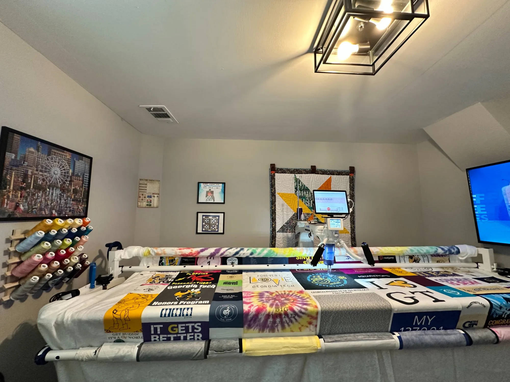
All of this, the photography, the digital arrangement, the color analysis, happens before I sew a single seam. It adds time to the process, but it's time well spent. A t-shirt quilt is a permanent object. It's going to hang on a wall or live on a bed for decades. Getting the layout right means you'll love looking at it for all of that time, not just in the first few weeks after you receive it.
When you work with me, you're not just getting someone to cut and sew your shirts together. You're getting a deliberate design process applied to something that matters to you. That's what makes the difference between a quilt that's functional and one that's genuinely beautiful.
Ready to Turn Your Shirts Into Something Beautiful?
Bring me your stack of shirts and I'll apply every one of these principles to create a quilt you'll love for years.
More from the Blog

What Is Computerized Longarm Quilting?
Wesley Hall explains what computerized longarm quilting actually does, how it differs from hand quilting, and why Atlanta home quilters send their finished tops to a longarm service.
A Look at Long Arm Quilting Services
How Quilts by Big Wes uses computerized long arm quilting in Atlanta to add custom stitching that brings your quilt to life, from t-shirt quilts to memory quilts.
Why I Built SewTracker: A Quilter's Solution to the Spreadsheet Problem
Ten years of custom quilting orders, one too many sticky notes, and a day job in technology. This is why I built SewTracker.
Let's Build Something Worth Keeping
Every quilt I make goes through this same design process, because your shirts deserve more than just being stitched together. They deserve a layout that tells your story well. If you have a collection of shirts you've been meaning to do something with, let's talk about what's possible. The consultation is free and there's no pressure.